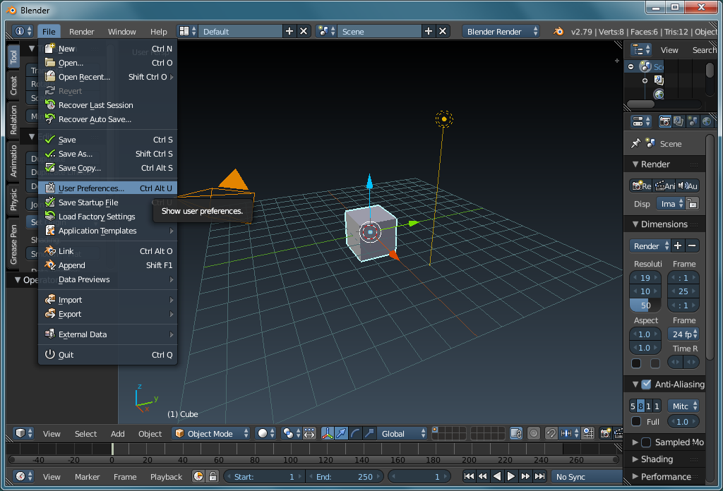
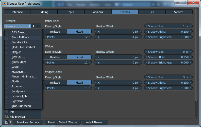
For my vision, the original theme coloring scheme made it hard to read. If you go to FILE >> USER PREFERENCES >> THEMES, you can choose other themes (use pulldown menu labeled presets). Choose one and then click SAVE USER SETTINGS then close the dialog box with the x in the top right corner.

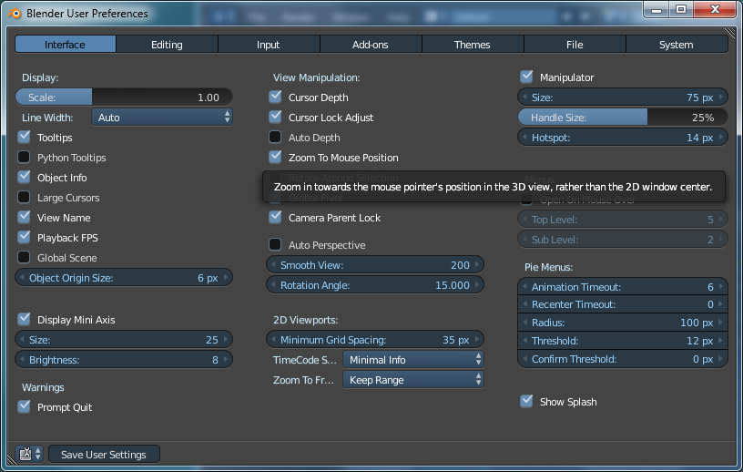
The theme you see here is 'Dark Blue Gradient'. While you're here, notice that there is an option to change the size of the text in the various tabs and menus. If you are having trouble reading the text due to size, you can adjust it here. The smaller text looks nicer but until you learn where the most important menus/panels/tabs are, the larger text may be better.

The first
bleeping (my swear jar is going to runneth over) thing you need to do is change the zoom to be related to the mouse position. This is the default in most other software (that I use) and it works spectacularly in 3D software. It's incredible that this isn't the default.

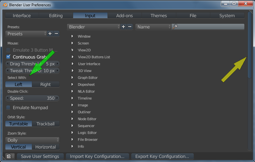
By default, Blender has the SELECT button on the RMB (right mouse button) and the CURSOR PLACING assigned to the LMB. The selecting function is almost universally done with the LMB. I'd suggest that you switch it. After you get more comfortable with the software, you can switch back but initially, there's no reason to have to go against what you're accustomed to AND learn new software. Also, in the following image, you can see that there isn't a lot of difference between the color of the scrollbar and the window. Just be aware that many themes are dark and may have features in their panels/dialog boxes that aren't obvious. If you don't see them, you may miss some of the features.

Back to the Top


